You might think I’m trying to be extremely sarcastic, but you could be the one who falls inclined to those scenarios without you even acknowledging it.
Let me share with you some best practices to exclude new users from your website’s next visits.

1. Hide The Content Well
Users seek content. However, you don’t need to maximize your content exposure. You’re capable of hiding your contents not only from your visitors but also from the search engine. How so? Just place your main content, main topic tabs, most important information, etc. out of reach.

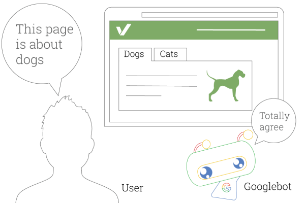
Selling cat food? Hide “Cats” away.
So both User & Googlebot misunderstand what your website is all about.
Some other ways to isolate your contents are disabling zooming and filling up the page with fixed-positioned elements. Try adding a big online chat window or newsletter subscription ad to cover the menu or sidebar.
2. Be UI Mobile-Unhandy
Are the CTA and link buttons large enough?
Are complex UI elements such as carousels implemented properly on any device?
Do you enable text selection on your web pages?
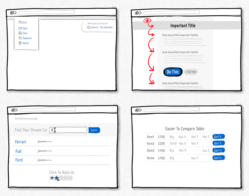
Is navigation easy to be found wherever possible, like these?

Say NO to every question in the above checklist and you’ll gain an unhandy UI to your needs.
3. Prevent Users From Saying Hi
If you allow users to browse through your pages and do nothing more, then don’t use any instant messaging plugin or live chat box on your website. I’ll bet the poor user is clueless in getting in touch with you.
There are plenty of premium live chat and instant messaging plugins, including Facebook Messenger for WordPress, Messenger for PHP, even with BOT, which works perfectly. But you don’t need it anyway.

4. Don’t Make Phone Numbers Tappable
Another good thing to do is to display your phone number as text so that the users have to go all the way from select, copy, go to Calls screen, and paste it. By this way, you can make the users know “Nothing worth having comes easy.”
Also for phone numbers, international numbers need the country code. Some websites targeting only a specific geographical area find it OK to leave merely the phone number. Besides, some other websites assume that the users are the one who should know where the website owner locates.
Well, just in case that’s not what you’re headed for, here is your span tag and Javascript to apply:
Phone: <span class="phone-number">123456789</span>Using jQuery and the isMobile detection library, we’ll replace the element with a phone-number class and a link:
if(isMobile.phone) {
  $('.phone-number').each(function() {
    $(this).replaceWith(
      $('<a href="tel:' + this.innerHTML + '">' + this.innerHTML + '</a>')
    );
  });
}
It looks like this on smartphones:
Phone: <a href="tel:123456789" class="phone-number">123456789</a>5. Let Go Of Your Visitors
To make sure nothing can entice your visitors to leave any contact details or any traces, avoid using contact forms of all kinds.
Although Contact Form 7 Database can help save your user and their queries to database, or Contact form 7 Multi step help decrease your form abandonment form, just do not ever try using it.
Ignore these useful Contact Form 7 add-ons no matter it’s Database for Contact form 7 or Multi-Step for Contact form 7.
Wrap-up
Now that you master all those 5 tips, you can rest assured that the website is shown to the visitors exactly as below:
