Many businesses opt for landing pages when launching a project or a marketing campaign to gain maximum user engagement. In addition to running their official websites, companies work on single-page websites focused on a specific product, service, or promotion. How to create a landing page design that converts? This guide highlights the key principles of building effective one-page designs and offers inspiration in the form of one-page WordPress themes for your inspiration. Let’s see what’s on the list.
Know Your Target Audience
One of the fundamental principles you must follow while launching any web design project is to know what audience you will target. Understanding your target users should give you a hint on how to create a landing page design that converts.
Creating a buyer persona is one of the best ways of creating a compelling web design project. The more detailed description you create, the better results you will achieve. For example, while working on the buyer persona, consider the gender of the customers you are targeting, their age, geography, interests, and other characteristics. Creating a landing page design with such findings proves more effective, regardless of your business niche.
Choose Color Scheme

It’s no secret that different colors appeal to different audiences in various niches. For example, while working on a landing page design for a business project, it’s better to use layouts made in blue colors. While working on a project promoting food-related venues, selecting green, yellow, and red should be your best choice for achieving a mouthwatering effect.
Let’s consider several WordPress landing page designs from the TemplateMonster digital marketplace as examples of clever color schemes on various topic-specific single-page websites.
Repix – Business Landing Responsive WordPress Theme
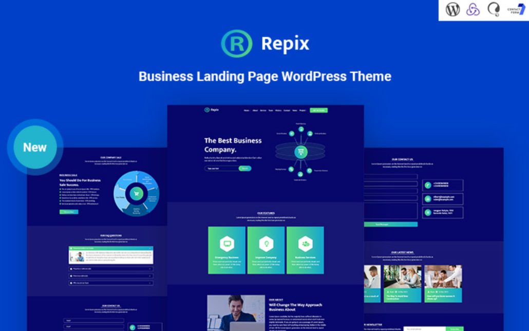
Repix is a ready-made landing page design ideally suited for diverse business needs. It’s one of those easy-to-use one-page WordPress themes you can customize code-free. It’s made with the Elementor page builder and includes all essential widgets and design elements to create an outstanding landing page. The theme loads fast on all devices.
Kaituku | Startup Landing page with Blog WordPress Theme
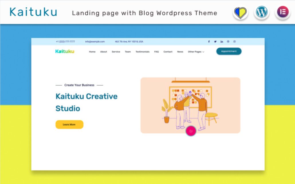
Kaituku is one of the best WordPress themes for launching a startup landing page design. It installs on your website with a single click and includes several ready-made color schemes. Moreover, it supports code-free editing with the help of the Elementor page builder. The theme contains multiple elements to showcase your content and make your project look credible for your audience. Thanks to the fully adaptive theme’s layout, there is no need to worry about how your content will be displayed on different screens.
Multiweb – Multipurpose Business Theme
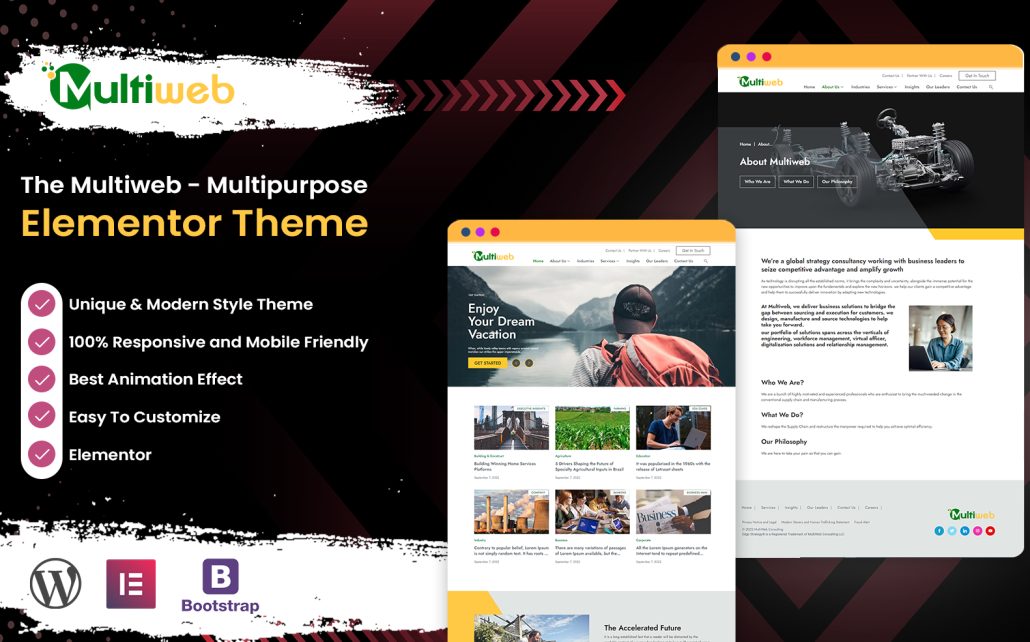
Multiweb is another example of a professionally built single-page website template. It’s a fully responsive, SEO-friendly, and speed-optimized HTML template. It’s made with Bootstrap and ensures your website will display an outstanding look on all devices. This is a well-documented and fully customizable web design solution, which you may feel free to adjust according to your brand’s specific requirements.
Fonts Impact
The clever choice of fonts for your landing page design significantly impacts the overall aesthetic appeal of your project and the text perception in particular. When picking the correct fonts for your website, you should understand that it goes beyond readability. Fonts can contribute to your brand identity, mainly if used in the logo design. Whenever launching a landing page, keep in mind the consistency of font usage across all your web design projects, especially if you are launching a landing page design along with your primary website.
Use Quality Visuals
Visual content is vital in web design, especially when launching a single-page website where every element matters. Using catching and high-quality visuals on a landing page design is important for several reasons.
- First of all, such content lets you capture your audience’s attention. The first impression matters. The same rule applies to web design.
- Next, the clever choice of visuals boosts your web project’s credibility and helps you and your deals get better promoted.
- Choosing visuals that match your brand and emphasize its main ideas or objectives helps you communicate your project’s message more effectively.
- Furthermore, quality visuals help you improve UX, contributing to a more seamless and enjoyable browsing experience.
Bold CTAs

A call-to-action (CTA) is one of the main elements of every landing page design. In fact, inviting users to click on the CTA is one of the primary purposes of every single-page website.
Regarding the CTA creation, every detail matters, from the color choice to the button’s position in the layout. In the perfect scenario, a landing page should contain a bold CTA laced at the top and further down in the content. Such a technique allows you to invite users to take action on your web page at different stages of their online journey. Some people prefer taking quick action, while others need to learn more about your offers before deciding to convert.
Landing Page Design Inspiration
Let’s move from theory to the landing page design examples you can find online. Whatever industry your project belongs to, launching a landing page is always relevant. Whether you are running a cafe or digital agency, a single-page website helps you better promote your deals by bringing the focus of users’ attention to your highlighted offers. Let’s review four landing page designs to understand how to create a landing page catering to your audience’s needs.
Columbus Trittico – eCommerce Landing Page Design Example
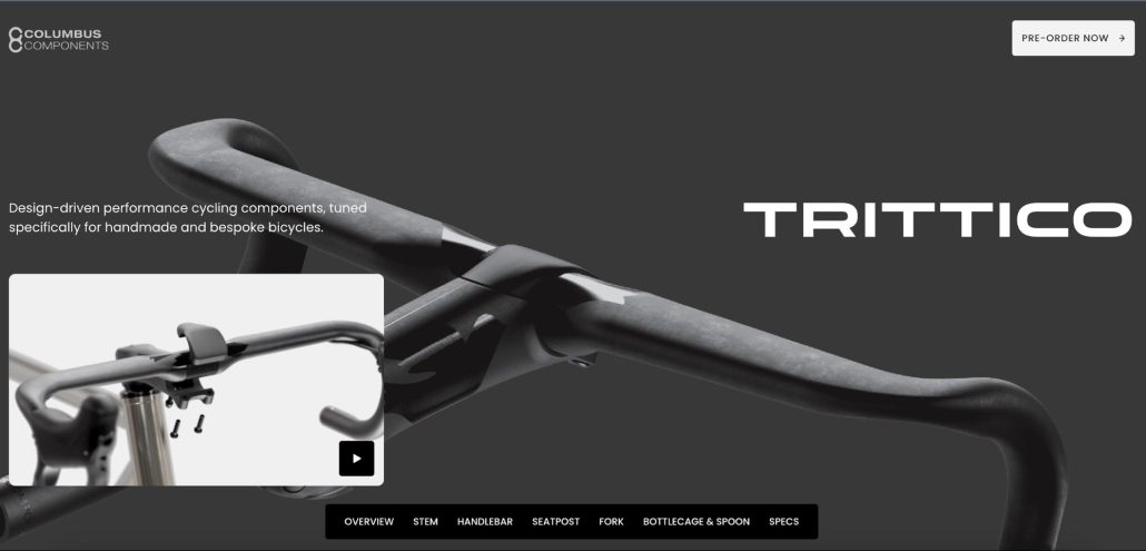
Columbus Trittico website features a remarkable design, bringing the Trittico components to the focus of our attention. Designed in a minimalist style, the eCommerce landing page design includes a sticky menu, taking users to the essential landing page design sections with a click. The primary CTA button also remains sticky at the top right corner of the web page, letting people pre-order the promoted products whenever they feel they are ready. The single-page website is built with a focus on performance. All elements load fast in all web environments.
Creative Direction Design – Interior Design Agency Landing Page
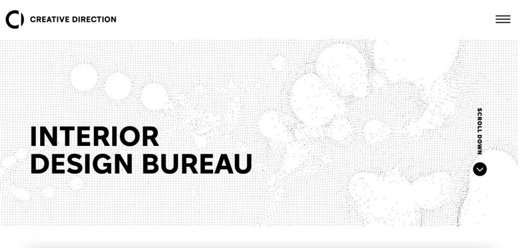
Next, let’s consider the landing page design of Creative Direction Design, an agency for interior design. The landing page design looks bold and clean, ensuring a contemporary approach that aligns with the current web design trends. The landing page design looks professional and trustworthy, making a lasting first impression on visitors. The design is easy to navigate, letting you easily find the information you are primarily interested in. Clear and bold call-to-action buttons intuitively guide users towards tracking the desired actions.
Dewestkop – Italian Kitchen Landing Page Design
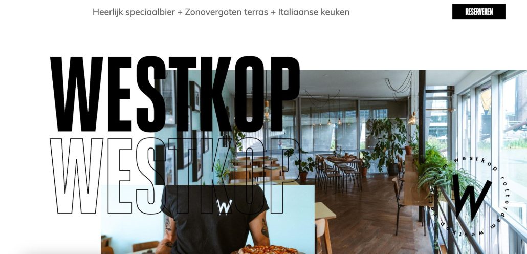
The Dewestkop landing page features a unique design, letting online visitors feel the atmosphere of the Italian food restaurant as if they were visiting it in real life. A rotating icon at the lower right corner of the landing age design accompanies website visitors as they navigate the content, remaining in a fixed position. The Dewestkop landing page design is optimized for mobile and desktop screens. The chosen black-and-white color palette looks by no means dull. On the other hand, it emphasizes the bold photos of the restaurant placed all over the design.
mgDesign Studio – Web Design Agency Landing Page
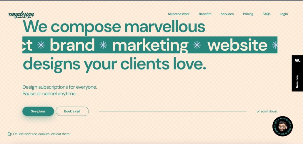
The mgDesign Studio is a web design agency composing marvelous designs. This commitment to perfection is easily noticed when visiting their landing page design. When you look at it, you notice it is very different from the other landing page designs we’ve reviewed. However, there is one feature the mgDesign Studio and Dewestkot have in common – a rotating sticky icon that cannot be left unnoticed. The design also includes a catching call to action button, inviting you to book a call.
Mobile Optimization

Here comes the last but not the least important point. Mobile optimization is pivotal in the modern world when almost 60% of all website traffic comes from people using mobile devices. Just imagine a website would miss more than half its visitors if the content doesn’t adjust to mobile screens.
Thanks to the variety of ready-made landing page templates for one-page web design projects, you can save plenty of time on creating such designs from scratch. Most of such products are already tested and optimized for the displays of all popular desktop and handheld devices, so you don’t need to waste time testing everything on your own. Simply choose the design that matches your industry and objectives, and feel free to install it on your website.
Conclusion
Basically, these are the fundamental principles of a well-built landing page design. Of course, no one-size-fits-all rule exists, and the techniques and strategies that worked well for one project shouldn’t necessarily fit another. Play wise and plan everything carefully before bringing your landing page design to life. If you do not know how to start with your single-page website, get inspired with examples of similar projects and use ready-made designs as the foundation of your one-page website.
