A product page on your WooCommerce store is a make-or-break spot where a customer either buys a product or moves ahead to check out other options available. While deciding the structure of your online store, you cannot go wrong with your shop page and product pages.
Did you know that during the second quarter of 2022, only 2.3 percent of global e-commerce website visitors converted into customers?
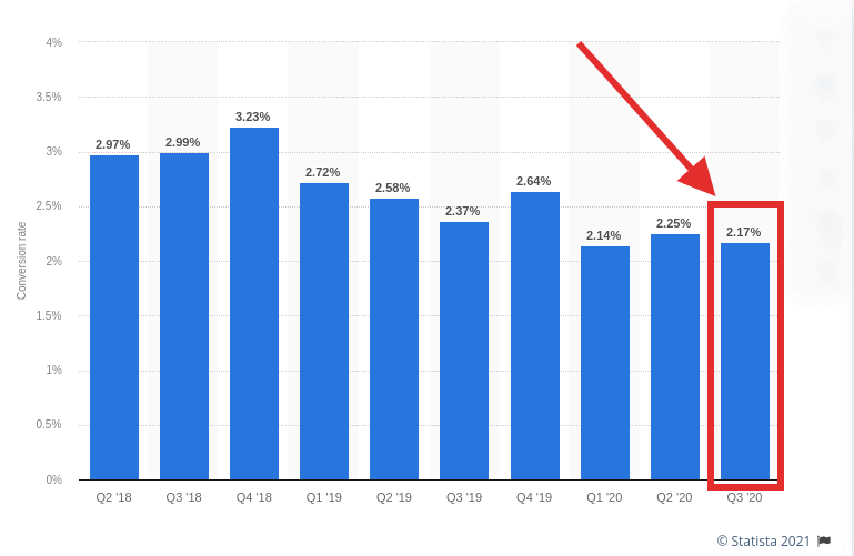
This may sound like bad news, but I can see that it is an opportunity to target many potential customers, provided you optimize your website for higher conversion. While the journey of creating a WooCommerce product page is easy, strategic optimization makes it a powerhouse of sales and gains a massive amount of traffic.
To maximize the conversion rate of your WooCommerce product pages, they have to be displayed strategically using all the important eCommerce elements.
With the help of this post, I’ll be sharing with you some important tips that you can use to create a converting WooCommerce page.
1. Describe Your Product Wisely
A product gets a lot of focus from the visitors if its description is crystal clear. By writing a catchy yet unambiguous title for your product, you grasp the attention of the shopper as soon as they visit the page.
A WooCommerce product page is described by the merchant through the following components:
Title
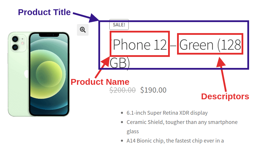
The title of a WooCommerce product is for providing the user with vital information. It could be the name of your product or descriptors such as color, storage, size, or even a combination of these. So basically, the title of your WooCommerce product page is a blend of important information that motivates the prospects to explore the product page.
People search for product-specific keyphrases and including these into your WooCommerce product page title can give you huge SEO benefits. The best tip that I can give you is to create a title that includes:
- The name of your product.
- One or two most important features as descriptors
- Clear communication of product value
An encouraging title is both important for converting a shopper and bringing quality traffic to your WooCommerce product pages.
Product Specifications
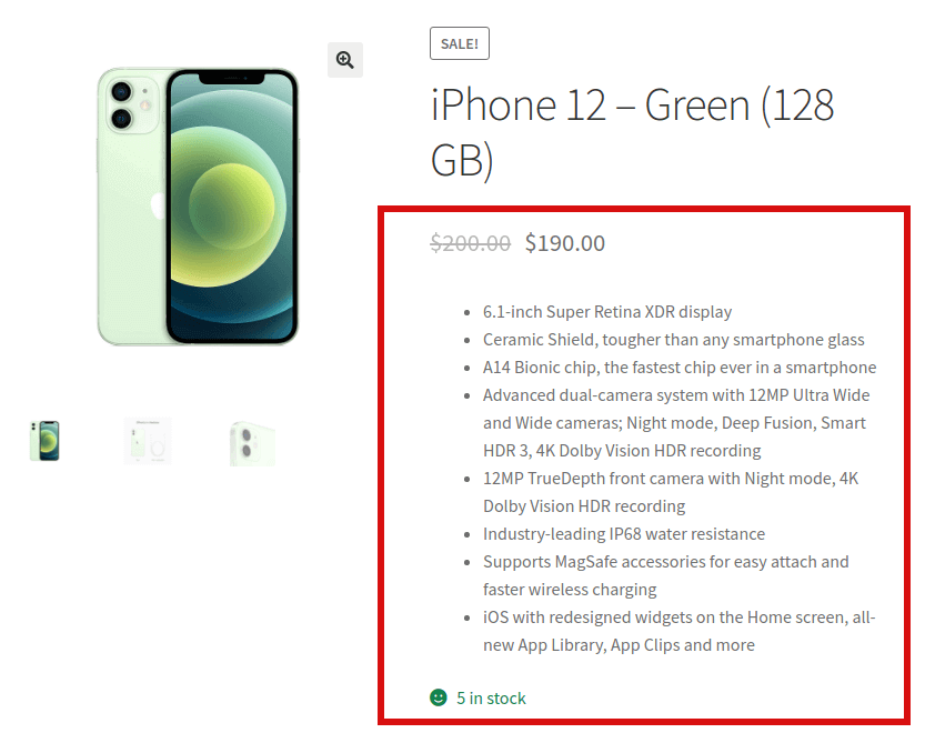
The WooCommerce product data box allows the merchants to write the specifications of the products.
Product specifications are basically short descriptions that outline the key features of a product. It is the product specification that effectively communicates the voice of your product and answers a customer’s biggest question: “Why should I buy this product?”
Here are some guidelines that you can follow while writing the specifications of your WooCommerce product:
- Make sure to include all the unique and important information about the product. For example, size, color, and anything else that is unique to that product.
- If you are offering something that is not offered by your competitors, make sure to include it in the specifications.
In short, you have to focus on things that strictly define your product using clear and unambiguous words.
Oh! Did you know that 20% of shoppers decided not to buy a product because they couldn’t find the information they needed?
Description
So you’ve named your product with a quirky title and encouraged your audience to explore the product by writing the relevant specifications. What’s the next step?
The next thing you need is a detailed description of the product or what we can say is a long description. But make sure you don’t write a big wall of text instead, work upon segmenting the information into unique sections.
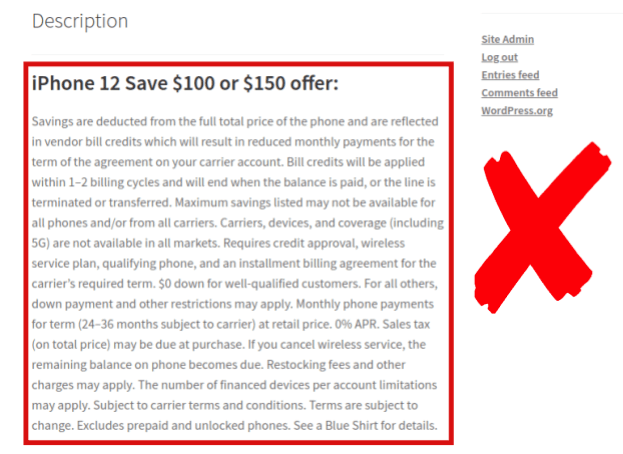
While writing a description of your WooCommerce product page, here are some tips that I’ll recommend:
- Begin the description of your product with the most important detail first. What I want to say is that keep the vital information on the top that influences the buying decision of your shoppers.
- Divide the description of your products wisely using heading, sub-heading, or bulleted points.
- Include a phrase or two that describes the potential benefits of your product to the customer.
2. Imagery Is More Persuasive Than Text
Images play a very important role on a WooCommerce product page. As per Jeff Bullas, 67% of consumers say the quality of a product image is “very important” in selecting and purchasing a product.
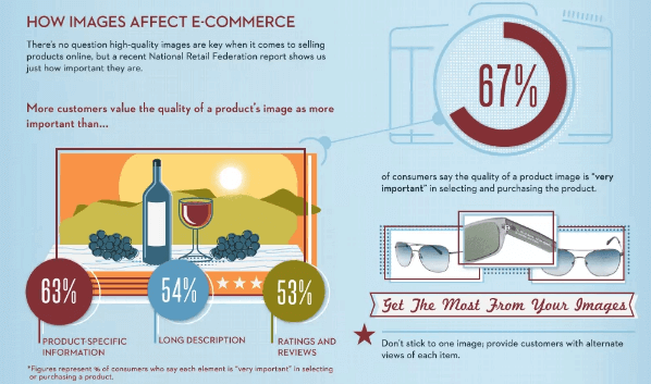
Therefore, you need to have at least one high-quality picture that lets your customers visualize the goodness of your products. Okay, understand it like this your website is a virtual showroom for your customers. Thus, to capture their attention you need to display your products in the right light.
Just look at how KeySmart uses graphical content to portray the sleek features of its products.
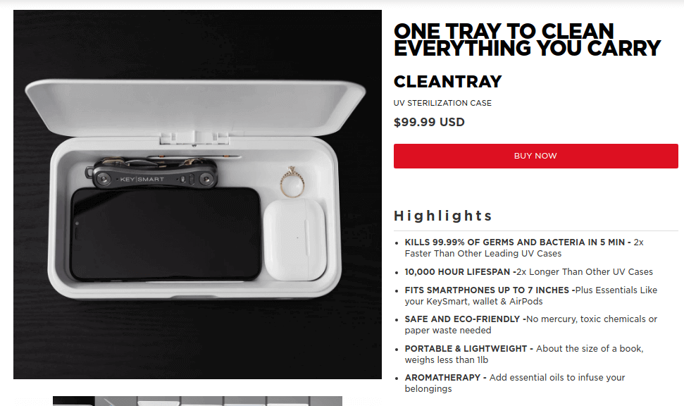
On their product page, you’ll not only find still images but a detailed video that portrays every nook and corner of the product.
3. Encourage Social Proofing On Your WooCommerce Product Page
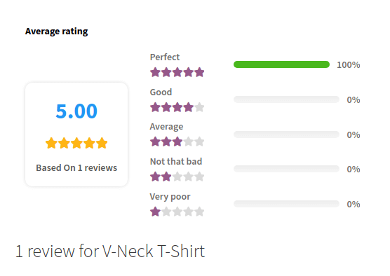
Believe it or not, customer reviews have a huge impact on the buying decision. According to Invesp, 90% of people read customer reviews, and 88% trust these reviews as much as a personal recommendations.
Here’s how displaying social proof on your WooCommerce product page can benefit you:
- Customer reviews play a significant role in influencing the buying decisions of customers. The power of reviews is 12 times more than just biased advertising.
- Since eCommerce websites are intangible and customers cannot touch and feel your products, it is very hard for them to judge the quality. Therefore, reviews play a very important role in gauging the quality and deciding if it’s worth investing in.
- Customer reviews are the easiest and most convenient way of collecting user-generated content for your WooCommerce product pages. Therefore, not only do they improve the conversion rate but amplify the SEO efforts too.
- While positive reviews aid in converting a prospect into a qualified lead, negative reviews and testimonials let you identify the areas of improvement.
Understand it like this, negative reviews are a mirror for your business that lets you see your flaws. Therefore, you can identify work upon them to solve them for customer satisfaction.
WooCommerce provides the store owners a complete system for managing reviews and ratings on the WooCommerce product pages. But the problem is that it lacks certain features that are necessary for making the review section engaging and interactive.
Therefore, you need a solution that can extend the default WooCommerce reviews system and implement all those features that are necessary for the reviews to be intrusive.
Product Reviews For WooCommerce is a plugin that uses the power of social proof and enhances the review and rating tab for your customers. As I said this is the all-in-one solution that you need to make the review section engaging, welcoming, and interactive for your customers.

Here are some prominent features that make the plugin a must-have for your WooCommerce product pages:
- With the Product Reviews For WooCommerce plugin, you can allow your customers to attach media files such as videos and images along with textual feedback.
- The merchants can collect ratings from the customers for various attributes like the color, size, and feel of the product. This will help the other shoppers visualize the haptics which fills the gap between a tangible physical store and an eCommerce website.
- WooCommerce merchants send reminders to customers that haven’t reviewed and rated their recent shopping experience. Since the plugin offers integration with Twilio, you can send SMS reminders too to your customers.
- You can lure your customers into reviewing their orders by giving them a generous discount. The Product Reviews For WooCommerce plugin allows the merchants to offer an exclusive discount coupon to shoppers that review their purchase for the first time.
- The merchants can also add a question-and-answer module to their WooCommerce product page. Therefore, the customers can ask questions about the product and be answered either by you or fellow shoppers.
In short, with the help of Product Reviews For WooCommerce, you can create a review section that is offered by eCommerce giants such as Amazon. Also, it makes it easier for the merchants to manage the reviews submitted by the customers on your store.
4. Make The Shopping Cart Icon Prominent And Accessible
The entity that marks the beginning of conversion for a WooCommerce shop page is the shopping cart. It contains the products that the shoppers are sincerely willing to buy.
Therefore, you have to make sure that the shopping cart icon is prominently displayed and accessible to your customers on the WooCommerce shop and product page.
The one tip here I would like to recommend is using a sticky cart icon.
A sticky cart icon or a floating cart button is an icon that is always visible to visitors while they are browsing your website. This is a great way to optimize the shopping experience by allowing customers to make instant edits to their carts without having to go to the cart page.
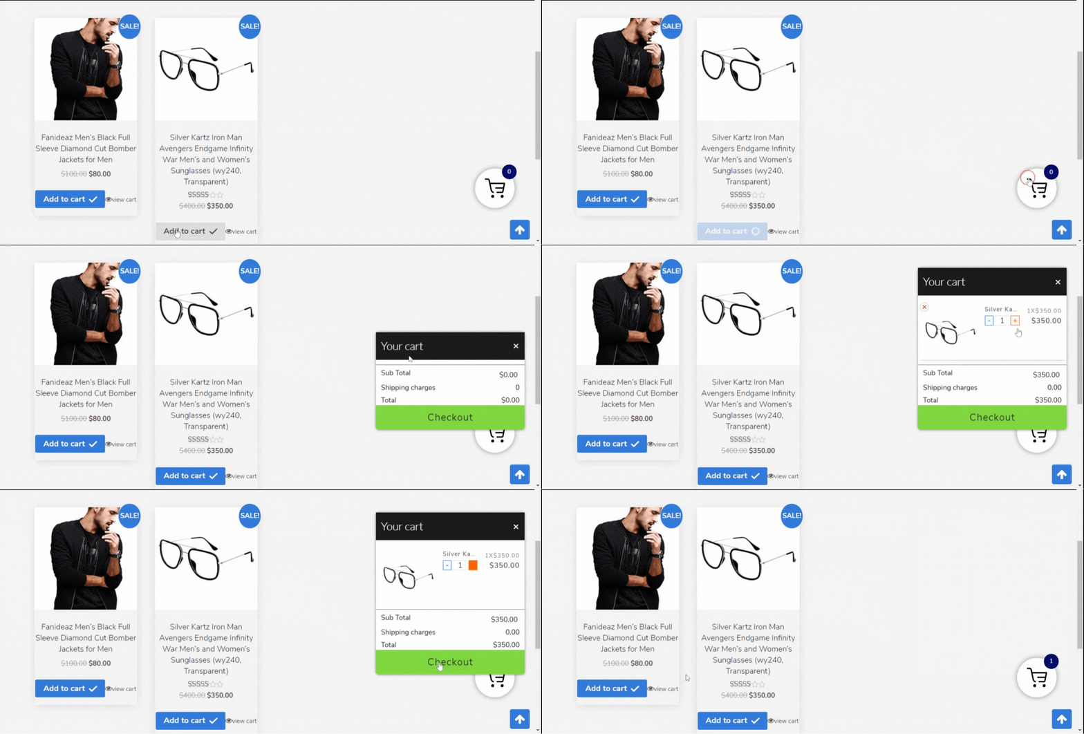
For WooCommerce, you can try out the Floating Cart Popup extension that lets you add the functionality very conveniently.
Though it’s not a necessity for creating a converting WooCommerce product page, I highly recommend you invest in this plugin if you want to:
- Improve the shopping experience.
- Simplify the checkout process and reduce cart abandonment.
- Most importantly, boost conversion rates.
5. Improve The Searchability Of Your Products
To make your WooCommerce product pages a powerhouse of conversions, you need to make your products discoverable. The reason is if the customers aren’t able to find the products, they may eventually lose interest in doing business with you.
Let’s see some numbers that will surprise you:
Clicktale ran an analysis in which it took some small retailers (websites with Alexa Rank of 10,000 and greater) and some big retailers (websites with Alexa Rank below 10,000). The results were as follows:
- Smaller retailers tracked a visitor dwell time of 200 seconds, on the other hand, the larger retailers could make their visitors stay for only 70 seconds.
- But here’s the catch. The bounce rate for small retailers was around 34% whereas the bounce rate for large retailers was only 9.4%.
What does this actually mean?
When you put both numbers together you’ll understand that:
- Shoppers are spending more time browsing the websites (hence the dwell time is high) and are leaving the website.
- But they aren’t able to find the desired products and leave the website which explains the high bounce rate.
On the other hand:
Retailers that make the browsing experience easy for customers see tremendous output in the form of low bounce rates.
Clicktale concludes the report by saying:
“Short dwell time on page can indicate that users leave the site too quickly. When combined with low bounce rate, however, it actually indicates that users find what they are looking for faster.”
Now that you understand how important it is to work on the searchability of your WooCommerce products, let’s see some solutions.
Product Filters
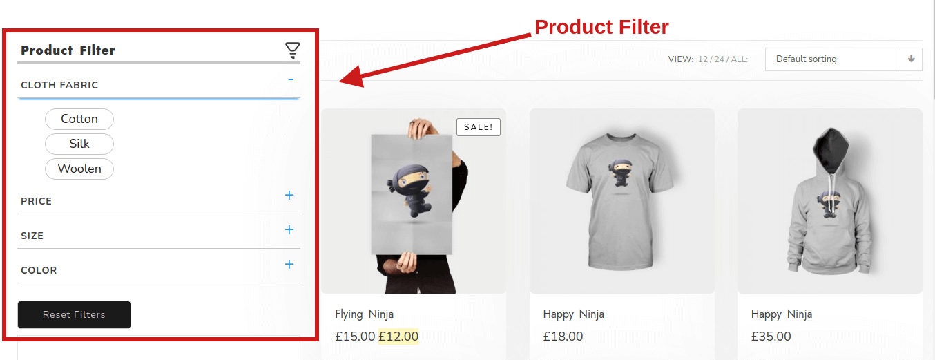
So a product filter is a way by which a shopper can use some checkmarks for finding the options in your store that meet his/her needs.
With WooCommerce Product Filters, one can ease down the search experience for a shopper. It also saves a lot of time for your customers by narrowing down the choices and making the customers less overwhelmed.
Quick View
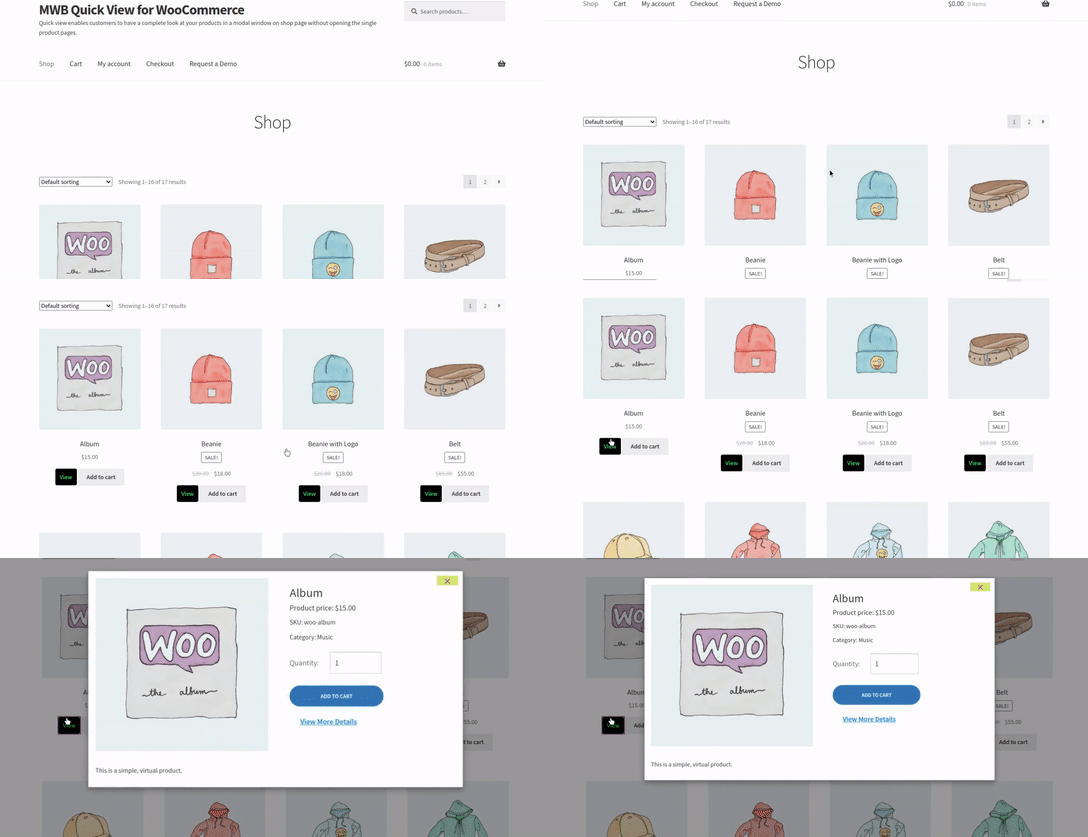
Quick view is a method by which you can show the details of a product to the customers via an overlay window on the WooCommerce shop page.
The motive is to give a sneak peek without having to exit the shop page. Although this is optional and depends upon the merchants, however, it has some great usability benefits such as:
- It improves the shopping experience by eradicating the time wasted in going back and forth between the WooCommerce shop page and the product page.
- The quick view option makes shopping a lot easier for customers that have a huge shopping list.
- The users can take a quick glance at products and their descriptions without having to wait for the single product page to load.
MWB Quick View is an exclusive solution for WooCommerce merchants that lets you implement the quick view functionality for your products on the shop page.
Infinite Scrolling
Another underrated eCommerce page design hack that can improve a customer’s browsing experience to a great extent, infinite scrolling.
Infinite scrolling became popular after the social media platform leader, Facebook used it for increasing dwell time and engagement rate.
“Did you know back in 2014 American users spend an average of 40 minutes a day scrolling on Facebook?”
Inspired by Facebook, today many eCommerce giants prefer the infinite scrolling setup to the regular pagination for 3 reasons:
- Allows the shoppers to interact with your WooCommerce store with a minimal number of clicks.
- Give your products better visibility.
- Enhance the shopping experience for mobile users and touchscreen users.
Infinite Ajax Scroll for WooCommerce is an extension that lets you convert the regular pagination of the WooCommerce shop page to infinite scrolling in a single click.
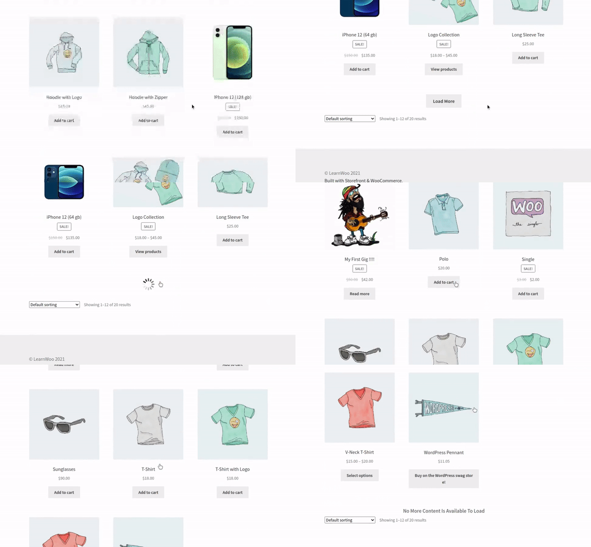
Combining product filters with infinite scrolling is a great concoction for improving the browsing experience for your shoppers and scale your conversion rates.
6. FAQs for Making Informed Decisions
Even if your product page content included every essential piece of information, there are some questions that remain unanswered. Including a FAQ section is the perfect resolution to this problem.
FAQs can be many many times more important than you think. They are the assurance for your customers that makes them feel confident in their decision to purchase your product.
For writing FAQs, you need to back up your answers with some data to ensure relevancy. To collect data, you can:
- Take the help of support tickets raised by your customers.
- Work rigorously with your sales and support team because they are the ones that directly interact with your customers.
- Adhere to customer feedback. Analyze them to understand what emails you receive and what common questions your customers ask.
- You can also take the Product Reviews For WooCommerce plugin mentioned by me in the “Encourage Social Proofing On Your WooCommerce Product Page”. Using the plugin, you can create a Q&A module where you can check the questions submitted by your customers.
7. Use Clear Call-To-Actions To Nudge An Onlooker
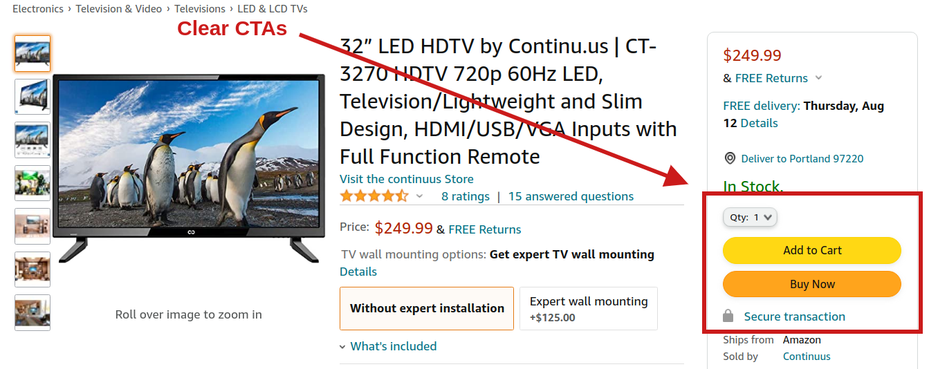
Call-to-actions (CTAs) are vital for converting a prospective customer instantly.
On a WooCommerce product page, a CTA serves the purpose of grabbing the attention of a customer that is interested in your product. The CTAs on your WooCommerce product page should be big enough so that they are visible and use a font that is less whacky with a color that stands out.
Here are some tips for designing effective CTAs:
- Ensure the right shape and size of your CTA. The buttons should be big enough to capture the attention of customers.
- Try to include the element of urgency wherever possible. Use words ‘Quickly’, ‘Hurry’, ‘Now’, or ‘Limited Edition’ to make customers purchase products instantly.
- For boosting the conversion of your WooCommerce product page try to incorporate a value proposition.
- The final recommendation for creating a converting CTA is regularly testing your CTAs and optimizing them for better results.
Ready To Create Your WooCommerce Product Pages?
With this, we come to the end of our article. I hope using these techniques you’ll be able to scale the conversion rate of your WooCommerce product pages and increase your customer base.
As I said earlier, displaying products in a way that encourages their sales is way more strategic than uploading the products. Therefore, please invest time in the process so that you can reap the benefits with higher profits.
 Himanshu Rauthan is an entrepreneur, Co-Founder at MakeWebBetter, BotMyWork, and the Director of CEDCOSS Technologies. He has worn many hats in his career – programmer, researcher, writer, and strategist. As a result, he has a unique ability to manage multi-disciplinary projects and navigate complex challenges. He is passionate about building and scaling eCommerce development.
