Since technology is emerged in every aspect of daily life, chatbots are increasingly used to assist conversational interfaces. Business owners and marketers are trying to improve chatbot the way they want.
While making our own BOT and creating custom bots for clients, we have conducted research and user tests to get the best practices to build chatbots. I believe most of the guidelines below apply to conversational interfaces at large.
1. Always Show A Way Back To The Main Menu
It’s best to train your audience or users to say “help” or “start over” from the onboarding process to the end of the interaction. Like the Home menu on any website, you had better put a way back on your chat bot developing requirements to make sure your users can always reach Home – where their journey with your brand has started.
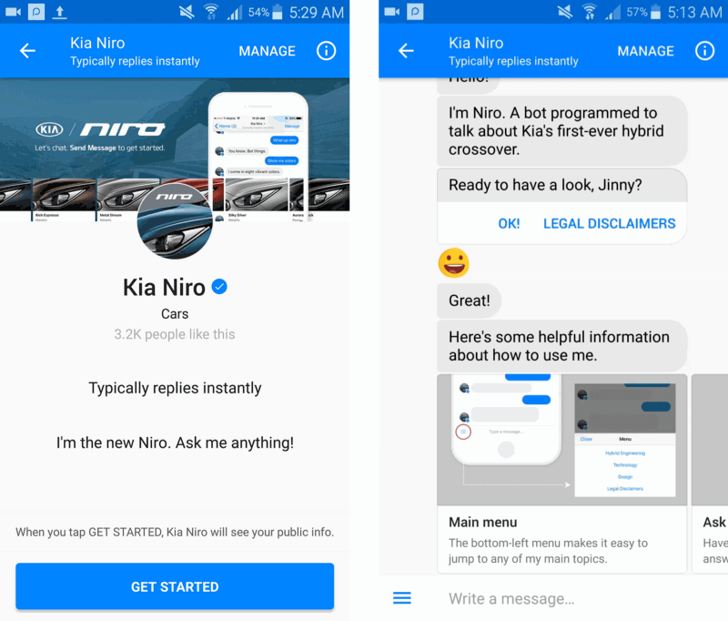
Kia Niro took an interesting approach to the onboarding process by using the carousel to explain how to use a Facebook Messenger chatbot.
Regardless of the approach, the user should know how to get to the main menu and how to reset the conversation at any time during the interaction.
2. Test Your Chatbot On Different Devices
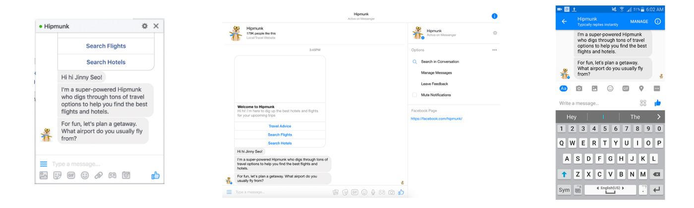
In addition to its lengthy messages, Hipmunk makes users scroll up to read its messages because its opening statement includes an image.
You should be testing your chatbots on different devices. While there is no need for fancy responsive frameworks, optimizing for different screen sizes is a quick, easy way to gain usability points.
3. Build An Environment Where Users Feel Safe To Explore
Payments in Facebook Messenger is still in beta, so most chatbots involving shopping eventually redirect users to their respective websites. One of the biggest problems with these redirects was that it was impossible to distinguish which buttons would result in a redirect and which buttons would continue the conversation in Messenger.
One could argue that the blame is on Facebook for using the same button UI for two distinct kinds of interactions. However, it’s our job as designers to work with the platform and make sure that we give users the best experience possible. Unpredictable interactions result in distrust. You should make clear to users if a button is going to redirect to a new website. Otherwise, users are going to be wary of exploring and discovering your chatbot.
4. Use Webviews to Redirect Users out of Messenger
Facebook offers webviews and extensions, allowing “custom experiences that still appear to be part of the Messenger thread.” Webviews pull up over your conversations, mitigating the disrupted flow by giving the impression that the conversation is being continued inside the Messenger app. If you must redirect, use webviews to make for a smoother conversational experience.
5. Know That Buttons and Quick Replies Give An Illusion of Limited Choices
Users are mistrustful of new technologies, and this mistrust translates into safe choices. Using UI components in developing chatbots is a great way to keep users on a happy path and to facilitate their cognitive and physical load, but there is a pitfall: the illusion of limited choices.
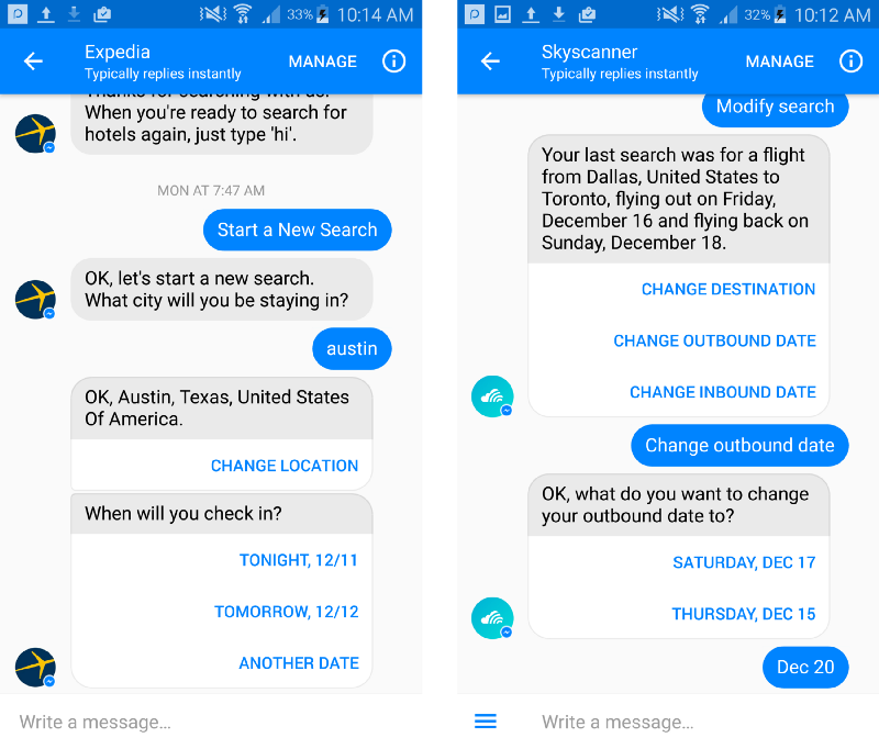
When I asked users to change their departure dates to a date that was neither of the two dates presented in Skyscanner’s two button options, hardly any users knew what to do. No one dared to venture into the text field with buttons in their view. When asked why they hadn’t manually typed the dates, the users either replied that they had not thought to do so or that they weren’t sure chatbots would understand their text input.
6. Put Clarity Over Elegance
As you may have noticed, instead of using the more common terms, “departure” and “return,” Skyscanner opted to use the terms “outbound” and “inbound” to describe dates.
Unfortunately, most of the users kept losing the meaning of the words throughout their interactions with Skyscanner. The more times these words were repeated in a conversation, the more confusing they became, especially when attempting to error-correct.
Clarity wins over elegance, every time.
7. Confirm by Asking, Not Stating
Statements place the blame on the user. If the user is trying to book a flight next Monday, but the chatbot interprets it as this Monday and says, “You’re booking a flight this Monday,” the user will feel that he made a mistake by saying the wrong thing.
A simple way to improve chatbot is to say, “Is it correct that you want to book a flight this Monday?” Formulating confirmations as questions also allow users to correct their input. Re-questioning or confirming is a natural way to correct misunderstandings and cuts down on the user annoyance when something goes wrong.
8. The Response Will Follow The Question
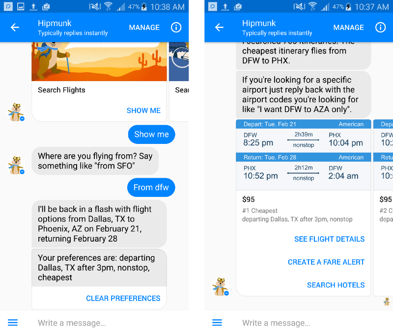
One of the first questions Hipmunk asks is, “What airport do you usually fly from?”
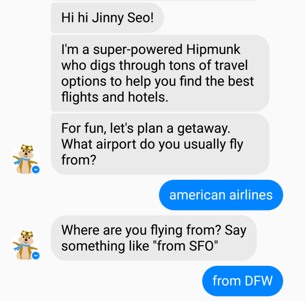
In one of the user tests, the user replied with “american airlines.” Not understanding her response, Hipmunk rephrased its question: “Where are you flying from? Say something like ‘from SFO.’ ” This finally prompted the correct response, “DFW.”
How you formulate your questions will affect the user’s responses. Although both questions had the same meaning, the use of “what” versus “where” resulted in two completely different answers.
Be purposeful about the wording of your question, and be especially thoughtful of how you begin your question.
9. Don’t Leave the User Hanging
In traditional apps and websites, users have patience for only a few milliseconds before they think something is wrong. Designers have dealt with this challenge using loading icons and messages for applications that take more time.
UX in messaging interfaces appears to be subconsciously informed by texting with other humans, which always has some amount of lag time. In my user studies, I found that 8 seconds is about how long a user will wait until he or she starts trying to reboot the “unresponsive” chatbot.
10. Undo and Cancel as a Functionality
Neither chatbots nor humans are perfect, so undo and cancel are essential functionalities for a smooth conversational experience. We should be able to suspend a search or go back a step in a conversation just as easily as we can close out of a window or press “back” on a web browser.
Wrap Up
These functionalities are crucial for good interactions. It keeps users from having to start all over. If a user has spent the last three minutes interacting with your bot and happens to make a mistake, do not make the user have to retype everything. Keep track of state and adjust accordingly.