Looking for the main reasons multi-step forms convert better than long single-page forms? In this article, we will give you 5 reasons you should know…
A long single-page form asks for everything at once. Name, email, phone, budget, file upload, and extra notes sit on one screen.
Many visitors never start. The ones who start often leave before submitting. Multi-step forms split that wall of fields into smaller screens. The first step is short. Progress is visible. Each screen has one job. That is why they convert better on quote requests, applications, bookings, and lead forms.
This article covers five reasons the step format wins, when a short single-page form is still the right call, and how to plan steps without adding friction.
First, let’s see what makes a form feel long.
What Makes a Form Feel Long
A form feels long when the visitor sees too much work before they have committed to anything. Ten fields on one screen can feel heavier than twelve fields split across three short steps. The problem is the first view, not only the field count. Required stars, extra dropdowns, file uploads, and open-text boxes add weight quickly.
So does a layout that stretches below the fold on a phone. If the visitor has to scroll past a block of inputs before they understand the next action, the form already feels like a chore. Context matters too. A newsletter form with three fields is fine on one page.
A quote, application, or booking form is different. Those forms collect details the business needs, but the visitor did not arrive ready to fill a document. If the first screen looks like paperwork, completion drops before the first answer is typed.
5 Reasons Multi-Step Forms Convert Better Than Long Single-Page Forms
| Reason | Multi-step form | Long single-page form |
|---|---|---|
| First-screen friction | Step one asks for little, so more people start | The full field list appears at once, and many visitors bounce |
| Progress and commitment | A progress bar or step count shows the finish line | There is no sense of progress, only a long page to complete |
| Mobile completion | One task per screen, less scrolling | Users pinch, scroll, and lose their place on a phone |
| Question order | Easy fields first, detailed or sensitive fields later | Every question sits in one block, including the hard ones |
| Data quality | Related fields are grouped, so answers stay more complete | People skip, guess, or abandon fields in the middle of the page |
1. Lower first-screen friction
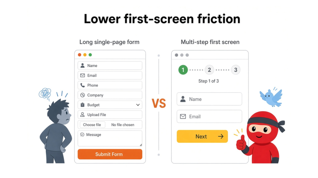
The first screen decides if the form starts at all. A long single-page form displays all fields on load. Name, email, phone, company, budget, file, and notes appear together. That looks like work. Many visitors close the tab before they type a single answer.
A multi-step form hides that load. Step one can ask for a name and email, or a single choice indicating what they need. The visitor can finish that screen in seconds. Once they start, leaving costs more than continuing. This matters most on paid ads, landing pages, and quote forms.
The visitor arrived for a result, not a questionnaire. If the first view feels light, more people enter the flow. If the first view looks like a document, the form never gets a fair chance to convert.
2. Progress makes people finish
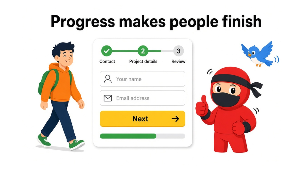
Once someone completes the first step, the form has a new job: keep them moving. Multi-step forms do that with a progress bar, a step counter, or a simple “Step 2 of 4” label. The visitor can see the finish line. That small signal raises the chance they complete the rest.
A long single-page form has no such marker. The page just gets longer as they scroll. There is no midpoint, no “almost done,” and no reason to treat the next field as a short task. Fatigue sets in midway through the page. Progress also helps when a field feels annoying.
A budget question or file upload is easier to accept when the visitor has already completed two steps and can see one remaining. The form feels like a path, not a wall. That is why completion often rises after you add visible progress, even if the total field count stays the same.
3. Better mobile completion
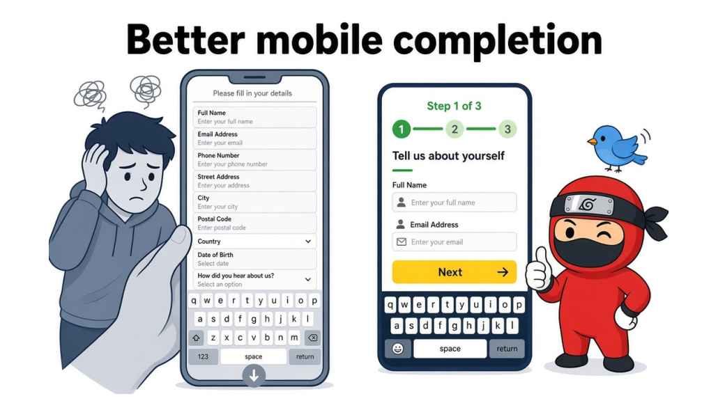
Most form traffic now comes from phones. A long single-page form is hard on a small screen. Fields stack, labels wrap, keyboards cover the next input, and the submit button sits far below the fold. The visitor scrolls, loses their place, and leaves. A multi-step form keeps one task on screen. Step one might be contact details.
Step two might be project details. The thumb does less work. There is less scrolling and fewer chances to tap the wrong field. Mobile also makes required errors worse. On a long page, the error can sit above the viewport. The visitor taps submit, sees nothing change, and assumes the form is broken.
Steps shrink that problem. Each screen has fewer fields, so the error is closer to the input. If your form is for quotes, bookings, or applications, test the mobile version first. That is where the long page loses the most completions.
4. You can ask better questions in the right order
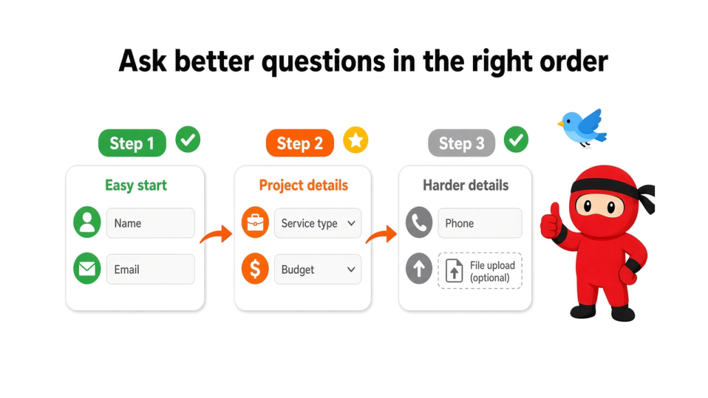
A single long form treats every question the same. Easy fields and hard fields sit in one block. Budget, file upload, phone, and “tell us everything” appear before the visitor has any reason to share that much. Multi-step forms let you sequence the ask.
Start with low-effort questions. Save phone numbers, budgets, uploads, and long answers for later steps. By then, the visitor has already invested some time, so the next question feels like part of the process. Steps also make conditional questions cleaner.
If they choose “support,” do not show sales fields. If they choose “quote,” skip the account setup questions. A long page can hide fields with logic, but the screen still looks busy. A step can remove whole screens that do not apply. The form asks only what that person needs to answer, in an order that feels fair.
5. Cleaner data and fewer abandoned fields
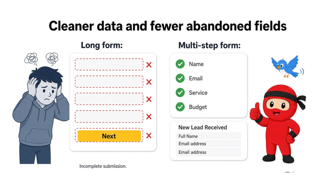
A long single-page form invites incomplete answers. People skip the middle, type “n/a,” or drop off after the easy fields at the top. You still get a submit sometimes, but the record is missing the details your team needs.
Multi-step forms group related fields. Contact details stay on one screen. Project details stay on the next. That grouping reduces skipped boxes because each screen has a clear job. If a step is required, the visitor completes that group before moving on.
You also see where people stop. If step three loses most users, that step is the problem, not the whole form. A long page hides that. You only see a completed form or an empty one. Better structure means fewer fake answers, fewer blank required fields, and a list of leads your team can actually use.
When a Single-Page Form Is Still Fine
A multi-step form is not the default for every page. If the form is short, the extra screens add clicks with no gain. A newsletter signup, a simple contact box, or a “request a callback” form with three or four fields should stay on one page. Single-page also works when every field is required and equally easy.
Name, email, and a short message do not need a progress bar.
The visitor can see the whole ask at once, which is a benefit on a small form. Use one page when the visitor already expects a quick submit: footer contact, popup lead magnet, event RSVP, or a comment-style request.
Switch to steps when the form collects a quote, an application, booking details, a file, a budget, or anything that looks like paperwork at first glance. The test is simple. If the first screen already feels light, keep it as one page. If it looks like a document, split it.
How to Plan a Multi-Step Form Without Hurting UX
A good multi-step form is planned around the first screen, the question order, and the phone layout. Do not copy a long form and slice it into random pages. Build the path first, then decide where each field belongs.
- Keep step one tiny: ask for a name and email, or for a single choice that routes to the next screen. The first step should feel easy to finish.
- Show progress: Use a step count or bar so people know how much is left. Hidden length is still length.
- Group related fields: Put contact details together, project details together, and files together. Each screen should have one job.
- Cut steps that do nothing: If two screens ask the same type of question, merge them. Extra next buttons lower completion.
- Make going back obvious: Let people edit an earlier answer without restarting. Mistakes are normal on mobile.
- Test the full path on a phone: Check labels, errors, file uploads, and the final submit with the keyboard open. If step three is where people stop, rewrite that step before you add more fields.
Common Mistakes With Multi-Step Forms
Multi-step forms convert better only when the steps reduce the work required. If you split a weak form into more screens, people still leave. The format is not the win by itself. The win is a lighter first screen, a clear path, and questions that appear in a fair order. These mistakes undo that.
- Too many steps: Three or four focused screens are enough for most quote and lead forms. Eight screens, each with one field, add taps without adding clarity. If a step does not change the question type, merge it with the next one.
- No progress signal: A step counter or progress bar tells the visitor the end is close. Without that, a multi-step form feels like a maze. People stop when they cannot tell if they are halfway or almost done.
- Hard questions on step one: Phone numbers, budgets, file uploads, and long text boxes raise drop-off when they appear first. Use step one for name, email, or a simple choice. Save the sensitive fields for later, after the visitor has started.
- No way back: People mistype emails and change their service choice. If they cannot return to the previous step, they abandon the form rather than fix it. A clear back action is part of the conversion design.
- Surprise fields at the end: A short first step builds trust. A final screen packed with extra required fields breaks that trust. Keep the last step predictable. If you need more detail, say so in the progress label.
- No mobile check: Most visitors will complete the form on a phone. Test each step with the keyboard open. Confirm that the next button stays visible, errors appear next to the field, and no step requires awkward side-scrolling.
Frequently Asked Questions
Now, let’s take a look at some frequently asked questions and answers on this topic.
They reduce the work the visitor sees at the start. A long page displays all fields at once. A stepped form shows a short first screen, then asks for more after the person has started. Progress, better mobile layout, and a fairer question order help more people finish.
Most quote and lead forms work well with three or four steps. Two can be enough if you only need contact details plus one extra screen. More than five is usually too many unless the process is an application with clear sections. Add a step only when the question type changes.
Keep it easy. Name and email, or one choice such as service type, is enough. Leave phone numbers, budgets, file uploads, and long messages for later. The first step is to get started, not to collect the full brief.
Yes, when each screen has a small set of fields. Phones make long pages hard to scan, and the keyboard can hide the submit button. Steps cut scrolling and keep the next action close to the last field. Always test the live form on a phone.
A progress bar or a “Step 2 of 4” label helps. People complete more forms when they can see the end. If you hide the length, the stepped form still feels long. Keep the indicator visible on every screen.
Use one page for short forms: newsletter signup, simple contact, callback request, or anything with three or four easy fields. Extra steps add taps with no benefit there. Use steps when the form looks like paperwork on first view.
They can. Grouped fields reduce the number of skipped boxes in the middle of a long page. You also see which step loses people, so you can fix that screen. You still need clear labels and only the required fields you will use.
No. Require only what your team needs to reply. Extra required fields raise drop-off, especially on later steps. If a field is nice-to-have, make it optional or move it to a follow-up email after the form is submitted.
Splitting a long form into too many screens and putting the hard questions first. Steps do not fix a bloated field list. Cut fields, keep step one short, show progress, allow a back button, and check the mobile layout.
Yes. Contact Form 7 does not include steps by default, but an add-on can split an existing form into screens and add progress. Contact Form 7 Multi-Step from Ninja Team is built for that workflow if you already run CF7 and want the conversion structure from this article.
Conclusion
Long single-page forms lose people before they can answer the first question. The page looks like work, the phone layout is messy, and the hard questions appear too soon.
Multi-step forms fix that by lowering first-screen friction, showing progress, keeping one task on each screen, asking questions in a fair order, and collecting cleaner data. Keep a short contact or newsletter form on one page.
Use steps for quotes, applications, bookings, and any form that looks like paperwork on load. Plan step one first, show progress, and test the path on a phone.
If you already use Contact Form 7 and want that step-by-step flow in WordPress, Contact Form 7 Multi-Step adds the screens, progress indicators, and conditional paths without rebuilding the form from scratch.
Start with a short first step, then add only the fields you need.