
Are you looking for the best WordPress notification bar examples to boost sales for your WooCommerce store? In this post, we will show you 10 examples to help you sell more products and increase revenue.
A notification bar only drives sales when the offer matches the page the shopper is already on. A sitewide “shop now” line is easy to ignore. A free-shipping note in the cart or a coupon on a product page is harder to miss.
These 10 WordPress notification bar examples are built for that kind of match. Each one has a single offer, a button, and a place to show it. Notibar handles the bar: message, colors, schedule, page rules, and a close button the visitor can use.
Copy the example that fits your store, then change the text to your real offer.
First, we will see what a sales notification bar should do.
What a Sales Notification Bar Should Do
A sales notification bar should do one job on the page where that job matters. If it announces three offers, links to the homepage, and never turns off, shoppers treat it as decoration.
- One offer: Free shipping, a coupon, or a sale end date. Not all three in the same line.
- A clear button: The button should name the next step, such as “Use code” or “Shop the sale,” and go to the page that completes it.
- Page rules: Show the shipping bar on the cart. Show the product offer on that product. A sitewide bar is for a storewide deadline only.
- A schedule: Set a start and end so a weekend sale does not still run on Tuesday.
- A close option: Let the visitor dismiss the bar. You can show it again after a set time, but do not trap it on the screen.
Notibar covers each of these in the bar settings: message and button, include or exclude pages, a start and end schedule, and close, toggle, or hide for good.
10 WordPress Notification Bar Examples to Boost Sales
| Example | What it drives | What you set in Notibar |
|---|---|---|
| Flash sale with an end date | Urgency for a storewide offer | Start and end schedule, one button to the sale page |
| Free shipping threshold | Larger carts | Bar on cart and checkout pages, text with the amount left |
| First-order coupon | New-customer orders | Code in the message, button to the shop, close after use |
| Product-page offer | Add-to-cart on one product | Show only on that product or page |
| Cart reminder on shop pages | Return to an open cart | Show on shop pages, hide on the cart itself |
| New arrival or collection launch | Clicks into a new collection | Button to the collection, end date when the launch ends |
| Lead magnet or newsletter signup | Email signups | Button to the form or landing page |
| Low-stock or limited batch | Faster decisions on a scarce item | Show on that product page only |
| Mobile-only shorter offer | Taps on small screens | Shorter mobile text, same offer |
| Rotating bars to test two messages | The line that gets more clicks | Two bars, rotation, then check click reports |
Let’s take a closer look at each option.
1. Flash Sale with an End Date
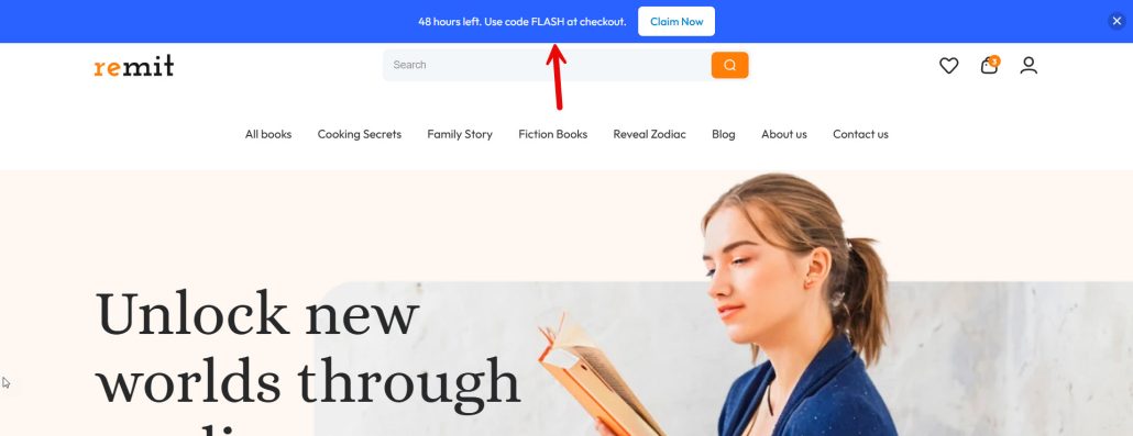
A flash sale bar works when the deadline is real, and the button takes you to the sale. “20% off ends Sunday” is enough. A second offer in the same line makes the bar harder to act on. Show it on the pages the sale covers. For a storewide sale, that can be the whole site.
For a category sale, limit it to that category. Set a start and an end in Notibar so the bar turns off when the sale does. Use one button, such as “Shop the sale,” and link it to the collection.
Bar text you can use:
- 20% off ends Sunday. Shop the sale.
- Flash sale: 15% off sitewide until midnight.
- This weekend only. Extra 10% off sale items.
- 48 hours left. Use code FLASH at checkout.
- Ends Friday at 6 pm. 25% off the summer edit.
- Last day of the flash sale. Shop before it closes.
2. Free Shipping Threshold
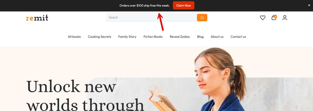
A free shipping bar works best when the shopper can see the gap. “Free shipping over $75” is useful on the cart, where the total is already visible. On a product page, the same line is a reminder, not a calculator. Show it on the cart and on shop pages.
Hide it once the order already qualifies, or switch the text to “You unlocked free shipping.” Set the button to the shop or the cart, not the homepage. In Notibar, limit the bar to those pages and keep the amount in the message the same as your real shipping rule.
Bar text you can use:
- Free shipping on orders over $75.
- You are $18 away from free shipping.
- Spend $50 more and shipping is free.
- Free shipping unlocked. You are good to check out.
- Orders over $100 ship free this week.
- Add one more item to reach free shipping.
3. First-Order Coupon
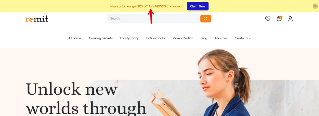
A first-order coupon bar should speak to someone who has not bought yet. Enter the code at the bar and send the button to the shop or to a starter collection. Do not stack a second discount in the same line. Show it on the homepage, in the shop, and on product pages.
Hide it on the thank-you page, where the order is already placed. If the code is new customers only, say that in the bar so returning buyers are not surprised at checkout. In Notibar, set the pages, add the code to the message, and use a close option so the visitor can dismiss it after they copy it.
Bar text you can use:
- New here? Use WELCOME10 for 10% off your first order.
- First order ships with 15% off. Code: FIRST15.
- Take $10 off your first order with code HELLO10.
- New customers get 20% off. Use NEW20 at checkout.
- Your first order is 10% off. Code: START10.
- Welcome offer: 15% off today. Code: FIRSTORDER.
4. Product-Page Offer
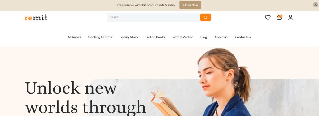
A product-page offer should name that product, not the whole store. A bundle, a matching add-on, or a short-term price cut belongs on that product page. A sitewide bar on the same page competes with it. Show the bar only on that product. Point the button at the add-to-cart area or a paired product, not the homepage.
Keep the line short enough to read above the product title. In Notibar, include that page or product and exclude the rest of the site. Pro can target specific WooCommerce products. The free plugin can do the same with a page rule if the product has its own URL.
Bar text you can use:
- Buy this lamp and the shade is 20% off.
- This week only: this serum is $8 off.
- Add the $12 travel case to this bag.
- Bundle the two refills and save 15%.
- Free sample with this product until Sunday.
- This item includes free engraving this month.
5. Cart Reminder on Shop Pages
A cart reminder belongs on the shop, not on the cart page. The shopper is already looking at products. The bar tells them an order is waiting. Keep it to one line: item count or a return link. Do not add a new coupon here unless the cart offer is the point of the bar.
Show it on shop and category pages. Hide it on the cart and checkout, where the reminder is redundant. Point the button at the cart. In Notibar, exclude the cart and checkout, include the shop pages, and allow the visitor to close the bar so it does not follow them throughout the session.
Bar text you can use:
- You left 2 items in your cart. Finish your order.
- Your cart is still open. Return to checkout.
- 1 item is waiting in your cart.
- Still deciding? Your cart is saved.
- Your cart expires soon. Review it before you leave.
- Pick up where you left off. View your cart.
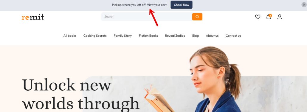
6. New Arrival or Collection Launch
A launch bar should name the collection and send people there. “New arrivals” with no link is a label, not an offer. Use it for a drop, a seasonal edit, or a restock that actually just went live. Show it on the homepage and shop. You can hide it on the collection page itself, where the products are already in front of the shopper.
Set an end date so the bar does not still say “just dropped” two weeks later. In Notibar, schedule the start and end, point the button at the collection, and keep the message to the launch. One collection per bar is enough.
Bar text you can use:
- The autumn is live. Shop new arrivals.
- Just dropped: the travel collection.
- New this week. Shop the linen drop.
- Restocked: the bestselling tote is back.
- Now open: the holiday gift edit.
- New colors just landed. See the collection.
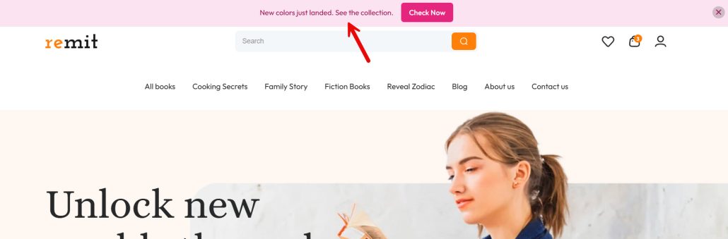
7. Lead Magnet or Newsletter Signup
A sign-up bar trades a useful offer for an email address. A discount code, a guide, or early access is clearer than “join our newsletter” with nothing attached. Send the button to the form or a short landing page. Do not ask people to sign up inside the bar itself. Show it on blog posts and the homepage.
Hide it on checkout so it does not compete with the order. Set the close button to stay closed for a while after a visitor dismisses it. In Notibar, point the button at the form, limit the pages, and use close for good or a delayed return so the same person does not see it on every click.
Bar text you can use:
- Get 10% off when you join the list.
- Free packing guide. Get it by email.
- Join the list for early access to new drops.
- Weekly deals by email. No daily spam.
- Get the size guide before you order.
- New recipes each Friday. Subscribe free.
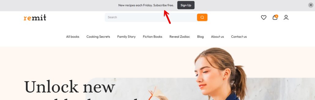
8. Low-Stock or Limited Batch
A low-stock bar only works if the limit is real. A fake “only 2 left” line trains shoppers to ignore the next one. Use it for a small batch, a discontinued color, or a product that is actually running out. Show it on that product page, not across the shop.
If the item sells out, turn the bar off the same day. Point the button at the product or leave the button off if the shopper is already on the page. In Notibar, include that product page only and set an end date you will check. Update the number when stock changes, or remove the count and say the batch is limited.
Bar text you can use:
- Limited batch. This color will not be restocked.
- Only a few of this size are left.
- Small run. This scent sold out last time.
- Last units of this print.
- This batch closes when the current stock ends.
- Made in a short run. Shop it while it is here.
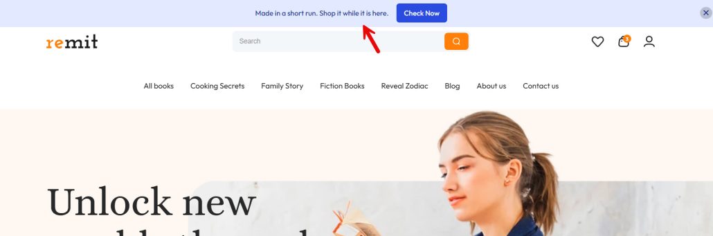
9. Mobile-Only Shorter Offer
A mobile bar has less room than a desktop bar. The same sentence that fits on a laptop wraps into three lines on a phone, pushing the product down. Write a shorter line for mobile and keep the offer the same. Show the full version on desktop if you need the code and the deadline there.
Keep the mobile line to the offer and one button. Notibar can use different content for mobile devices, so you do not need a second plugin for the short version. Test it on a phone before you publish. If the button wraps under the text, cut another word.
Bar text you can use:
- 20% off. Ends Sunday.
- Free shipping over $75.
- First order: code WELCOME10.
- New arrivals are live.
- Cart saved. Tap to view.
- Limited batch. Shop now.

10. Rotating Bars to Test Two Messages
Rotating bars let you test two lines for the same offer. One visitor sees the deadline. The next sees the discount. You keep the button and the landing page the same, so the clicks tell you which wording worked. Do not rotate unrelated offers.
A sale line and a newsletter line will not teach you anything. Run the test for a few days, then keep the winner and turn the other off. In Notibar Pro, rotation mode cycles the bars on a timer or at random, and click reports show which content was used. The free plugin can still run one bar at a time if you swap the text yourself.
Bar text you can test:
- Ends Sunday: 20% off sitewide.
- 20% off. Sale closes Sunday.
- Free shipping over $75.
- Spend $75, get free shipping.
- New here? Code WELCOME10.
- First order is 10% off. Use WELCOME10.
Get Notibar Now
Common Mistakes to Avoid While Creating Notification Bars in WooCommerce and WordPress
A notification bar fails when the offer, the page, and the timing do not match. These are the mistakes that waste the spot above the content.
- Too many offers in one bar: Free shipping, a coupon, and a new collection in the same line give the shopper nothing to click. Keep one offer and one button.
- Showing it on every page: A cart reminder on the homepage is noise. A product offer on the blog is noise. Limit the bar to the pages where that offer is valid.
- No end date: A flash sale that still runs after the sale ends makes the next deadline look fake. Schedule a stop time and remove the bar when the offer closes.
- A button that goes to the homepage: The click should land on the cart, the collection, or the form. A homepage link adds a step and drops people who were ready to act.
- No close option: A bar that cannot be dismissed covers the menu and the add-to-cart button. Let visitors close it, then bring it back later if the offer is still active.
- The same long line on mobile: A desktop sentence wraps on a phone and pushes the product down. Use a shorter mobile version of the same offer.
Notibar can set page rules, a schedule, a close action, and different mobile text. The copy still has to be one offer. The settings only control where and when that offer appears.
Here are some related articles you might like:
- 10 WordPress Notification Bar Examples That Actually Drive Sales
- 5 Reasons Multi-Step Forms Convert Better Than Long Single-Page Forms
- How to Edit Code Files Directly From Your WordPress Dashboard With Filester
- 7 Best WordPress Captcha Plugins Compared
- Why WhatsApp Blocked My Number and How to Fix It
Frequently Asked Questions
Now, let’s take a look at some frequently asked questions and answers on this topic.
Yes, when it names one offer and sits on the page where that offer can be used. A free shipping line in the cart, a coupon on the shop page, or a deadline on a sale page gives the shopper a next step. A generic bar on every page is easier to ignore. The click matters more than the view. If the button goes to the cart, the collection, or the product, the bar is doing sales work. If it goes to the homepage, it only takes up space.
Put it on the pages included in the sale. A storewide offer can run across the site. A category sale should stay on that category and its products. Always set an end time that matches the real deadline. A bar that still says the sale ends Sunday on Wednesday makes the next deadline look fake. One button to the sale collection is enough.
State the threshold in the same words your checkout uses. “Free shipping on orders over $75” is clear. On the cart, you can mention how much is left if you know the number. Hide the bar once the order already qualifies, or switch the text to a confirmation. Do not promise free shipping on a product page if the rule only applies above a set amount.
The code, the discount, and who it is for. “New here? Use WELCOME10 for 10% off your first order” is complete. Send the button to the shop or a starter collection. Hide the bar on the thank-you page. Say “new customers only” if returning buyers cannot use the code, so checkout does not feel like a trick.
No. A bundle, an add-on, or a price cut for one product belongs on that product page. The same line on the blog or the homepage has no product shown to the shopper. Limit the bar to that URL. Notibar can include a page or, on Pro, a specific WooCommerce product, and leave the rest of the site alone.
Show the reminder on shop and category pages, not on the cart or checkout. One line is enough, such as “You left 2 items in your cart.” Point the button at the cart. Add a close option so the bar does not follow the visitor for the whole session. Skip a second coupon unless the abandoned-cart offer is the point of the bar.
It can send people to a form. It should not try to be the form. Offer something concrete, such as 10% off or a short guide, and link the button to the signup page. Show it on posts and the homepage. Hide it on checkout. Let visitors close it, then keep it closed for a while. Notibar supports a button link and a close action, which covers this without a second bar plugin.
Only if the limit is real. A small batch, a discontinued color, or a product that is actually running out can use it. A fake count teaches people to skip the next warning. Keep the bar on that product page and turn it off when the item sells out. If you will not update the number, say the batch is limited and leave the count out.
The desktop sentence is too long. It wraps, covers the menu, and pushes the product down. Write a shorter line with the same offer, such as “20% off. Ends Sunday.” Notibar can set different content for mobile devices, so the desktop bar can keep the code and the deadline while the phone bar stays to one line. Check it on a phone before you publish.
Keep the offer, the button, and the landing page the same. Change only the wording. One line can lead with the deadline. The other can lead with the discount. Run both for a few days, then keep the one with more clicks. Notibar Pro can rotate the bars and report which content was clicked. On the free plugin, swap the text yourself and compare the clicks in your analytics.
Conclusion
Pick the bar that matches the page, not the one that sounds busiest. A flash sale needs an end date. A free-shipping line belongs on the cart. A first-order code should be placed in front of new shoppers. A product offer, a cart reminder, a launch, a signup, and a low-stock note each have their own page.
On a phone, use the shorter line. If two wordings are close, rotate them and keep the one that gets the clicks. Notibar is built for that setup. You write the message, add one button, choose the pages, set a start and end, and let visitors close the bar. Pro adds product targeting, mobile text, rotation, and click reports.
The free plugin on WordPress.org is enough for a single scheduled bar with page rules. Start with one offer, run it until the deadline, then turn it off. A bar that ends on time is easier to trust than one that stays up after the sale.
Do you know any other examples we could list?
Let us know in the comments.

